
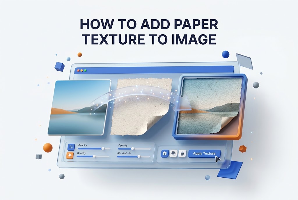
Flat digital images often lack warmth and character, even when the composition and colors look correct. Adding a subtle grain or fibrous finish can change that feeling instantly. Many designers, photographers, and hobbyists now want to learn how to add paper texture to image files to create a vintage, handmade, or artistic look. Paper texture softens harsh digital edges, adds depth, and gives prints a tactile quality that screens cannot show alone.
Whether you work in Photoshop, Canva, or a free mobile app, the basic idea stays the same. You place a texture layer over your photo, adjust its strength, and blend it naturally. This article walks you through tools, settings, and practical steps. You will learn how to pick textures, avoid common mistakes, and export clean, professional results for web and print. We cover both beginner methods and pro blending tricks so you can get realistic results without wasting time.
Why Paper Texture Makes Images Look Better
Digital photos can feel too clean and sharp, especially portraits and product shots taken in bright light. A light paper overlay breaks up flat areas, adds organic variation, and helps colors feel less artificial. It creates a printed look even on screen.
Many brands use this effect for packaging, social posts, and wedding albums because it feels warm and honest. Instead of a perfect plastic finish, you get soft fibers and gentle noise. That small change often makes viewers stop and look longer.
Selecting the Best Paper Texture Style
Not all paper looks the same, so your choice affects the final mood. Watercolor paper has deep bumps, kraft paper adds brown tone, while cotton rag is soft and light. Match the texture weight to your photo subject for balance.
For clean portraits, use fine linen or smooth matte paper with low contrast. For posters or street photography, try rough recycled or deckled paper. Always test at full size before deciding, since thumbnails hide detail.
Best Paper Types for Different Photo Styles
- Cold press watercolor: strong grain, good for landscapes and art prints
- Kraft brown paper: warm tone, works for rustic food and product photos
- Linen canvas: even weave, ideal for portraits and wedding images
- Recycled matte: light speckles, great for minimal lifestyle shots
- Old book paper: yellow tint with spots, perfect for vintage themes
- Cotton rag: very soft grain, safe for professional client work
Getting Your Image Ready for Texture Overlay
Start with basic cleanup before you add any effect. Fix exposure, white balance, and crop first, because texture will highlight dust spots and uneven tones. A clean base helps the grain sit evenly across shadows and highlights.
Resize your photo to its final output size if possible. Adding texture to a small file then enlarging it later makes grain look blurry. Work on a copy of the original layer so you can compare before and after easily.
Adding Paper Texture in Photoshop Step by Step
Open your photo in Photoshop and place the paper texture file above it as a new layer. Set the blend mode to Multiply for dark grain or Soft Light for light grain. Lower opacity to between 15 and 40 percent for a natural effect.
Use a layer mask to remove texture from faces or important details if needed. Paint with a soft black brush at low flow over eyes and text areas. This keeps the image sharp where it matters while keeping the paper feel elsewhere.
Fine Tuning Shadows and Highlights for Depth
Thick paper grain can darken shadows too much if left untouched. Open Levels on the texture layer and lift the blacks slightly to soften harsh spots. This keeps detail in dark clothing, hair, and night backgrounds.
For bright images, reduce highlights on the texture layer to avoid blown paper spots. A Curves adjustment helps here. Small tweaks make the overlay blend in instead of sitting on top like a filter.
Building Subtle Grain for an Authentic Paper Feel
Real paper is never uniform, so avoid a flat overlay at full strength. Duplicate the texture, rotate it slightly, and set the copy to 10 percent opacity. This breaks repeating patterns and adds random fiber variation.
Add a very light noise filter if your texture feels too smooth. Keep it under 2 percent to avoid dirt-like dots. For more ideas, see our article on vintage photo editing techniques on our main website for related finishing methods.
Quick Checklist Before You Blend Textures
- Save a backup copy of the original photo
- Choose texture resolution equal or higher than photo
- Fix color and exposure before adding grain
- Desaturate colored paper textures if needed
- Test Multiply, Overlay, and Soft Light modes
- Mask texture off small text and sharp eyes
- Zoom to 100 percent to check grain strength
Adding Paper Texture in Canva for Beginners
Upload your photo and your paper texture to Canva as separate elements. Place the texture over the photo, then use transparency and position tools to align edges. Use the Edit Photo filters to lower intensity until grain looks soft.
Canva does not have true blend modes in all plans, so transparency is your main control. Try 20 to 35 transparency for light paper. If colors shift, add a warmth filter to the photo first to match.
Adding Paper Texture on Mobile Apps
Apps like Snapseed, Picsart, and Lightroom Mobile make this easy without a computer. Import your photo, then use Double Exposure or Overlay import to add the paper file. Pinch to cover full frame and reduce opacity with the slider.
Keep edits non-destructive by saving steps as a preset or draft. Mobile screens hide fine grain, so check results on higher brightness. Export at maximum quality to prevent compression from ruining the texture.
Pro Tips for Clean Mobile Texture Edits
- Use PNG textures with high resolution, at least 2000 pixels wide
- Lower texture saturation to avoid color casts on skin
- Erase texture from faces with built-in mask brush
- Save custom filter preset for consistent Instagram style
- Export as JPG at 95 quality or PNG for print work
Adjusting Opacity and Blend Modes for Realistic Results
Opacity controls how visible the paper feels. Start low around 20 percent, then raise slowly until you notice grain in sky or skin areas. Step back from the screen often, because close viewing makes texture look stronger than it is.
Blend modes change how dark and light pixels mix. Multiply deepens fibers, Screen lightens, Overlay boosts contrast, Soft Light stays subtle. Try each mode on the same texture to learn the visual difference quickly.
How Light Direction Affects Texture Realism
Paper has direction, especially handmade and laid styles with visible lines. Rotate your texture to match the light in your photo. Side-lit portraits pair better with vertical grain, while flat product shots work with any angle.
Avoid flipping heavily stained textures, as shadows may look fake. If your photo has strong sunlight from the left, keep darker paper spots on the opposite side. This small match sells the printed illusion.
Key Benefits of Using Paper Texture Overlays
- Hides minor noise and compression artifacts in old photos
- Adds warmth and handmade character to digital work
- Creates consistent style across portfolio or feed
- Makes flat colors look richer and less synthetic
- Improves print look on matte and fine art paper
- Helps vintage, wedding, and craft brands stand out
Fixing Common Problems With Paper Texture Overlays
Too much contrast is the most frequent issue. If grain looks dirty, lower opacity, soften texture with slight Gaussian blur, or choose a lighter paper file. Heavy speckles distract from the subject and reduce perceived quality.
Color shifts happen with aged or brown paper. Desaturate the texture layer or set it to Luminosity blend to keep only detail. If edges show lines from resizing, feather mask edges or use a larger texture that fully covers the frame.
Using Free Versus Premium Paper Textures
Free textures work well for social posts and practice, but quality varies. Some are low resolution, have watermarks, or include uneven lighting. Always check license terms for client work and remove background stains that look unnatural.
Premium packs offer high resolution, clean scans, and varied tones in one bundle. They save time for professionals handling many projects. If you edit often, invest in one good set with matte, linen, and watercolor options included. You may also like our tutorial on film grain overlay effects for extra creative finishes.
Texture Source Comparison for Photo Projects
Source Type | Resolution | Best For | Watch Out For
Free stock sites | 1500-3000 px | Social posts, tests | Mixed quality, license limits
Premium bundles | 4000-6000 px | Client prints, branding | Cost, large file size
DIY scans | Depends on scanner | Unique custom look | Dust, uneven light
Phone photos of paper | 3000-4000 px | Quick creative work | Shadows, perspective warp
Advanced Blending Techniques for Professional Results
Once basics feel easy, combine two textures for richer depth. Use a fine grain at low opacity for overall feel, plus a stronger edge burn or torn border masked to corners. This layered approach looks less like a single overlay filter.
Try luminosity masks to apply grain mostly to midtones. This protects deep shadows and bright skin from heavy speckles. Work slowly with Curves on the mask until texture appears only where you want visible fiber.
Masking Texture for Portraits and Product Shots
Faces need lighter texture than backgrounds. Add a mask to your paper layer, then paint black over skin at 50 percent brush opacity. Keep some grain for cohesion, but let eyes, lips, and product labels stay crisp and readable.
For products, keep texture off reflective surfaces like glass or metal. Heavy grain on shine looks dusty. Use Select Subject in Photoshop to create a quick base mask, then refine edges manually with a soft brush.
Creative Uses for Paper Texture in Different Projects
Wedding photographers use soft cotton texture for albums and thank-you cards. It adds romance without heavy filters. Food bloggers prefer kraft paper for menus and rustic backgrounds that make dishes look homemade and inviting.
Artists sell more prints by matching texture to paper they actually print on. If you sell matte art prints, preview with a similar scanned texture. This sets correct buyer expectations and reduces returns from mismatched finishes.
Important Facts About Resolution and Print Quality
- Texture file should be 300 DPI for print, 72 DPI is only for web preview
- Always keep aspect ratio locked when scaling texture layers
- TIFF and PNG preserve grain better than low quality JPG
- Test print a small crop before printing large posters
- Calibrate monitor brightness to judge opacity correctly
Saving and Exporting Textured Images in High Quality
Export settings decide whether fine grain survives. For web, use JPG at 85 to 95 quality with sRGB color profile. Avoid heavy compression, which turns soft paper fibers into blocky artifacts around edges and gradients.
For print, save as TIFF or high quality PDF with layers flattened. Keep 300 DPI and CMYK if your print shop requests it. Name files clearly with texture type and opacity used, so future reprints match easily.
Conclusion
Good texture work is about restraint and purpose, not just stacking effects. Choose paper that supports your subject, prepare the base photo well, and blend with careful opacity and masking. Test on different screens, protect important details, and keep resolution high from start to finish. Once you learn how to add paper texture to image projects cleanly, you can build a warm, timeless style that works for portraits, products, and creative prints without looking over-edited.
FAQ
How to Add Paper Texture to Image in Photoshop Quickly?
Place a paper file above your photo, set blend mode to Soft Light, and lower opacity to 25 percent. Mask off faces if needed, then flatten and save as JPG for web or TIFF for print use.
Best Resolution for Paper Texture Overlays in Print Work?
Use textures at least 4000 pixels wide at 300 DPI for sharp prints. Lower resolution files blur when enlarged and create soft patches. Match or exceed your photo size for clean fiber detail.
How to Add Paper Texture to Image Without Photoshop Tools?
Use Canva, Snapseed, or Picsart with overlay or double exposure features. Import paper as second image, reduce transparency, erase from key details, then export at highest available quality setting.
How to Prevent Skin From Looking Dirty With Grain?
Lower opacity to 15 to 20 percent on portraits and mask texture off faces. Desaturate the paper layer and soften with slight blur. Always zoom to full size to check skin areas closely.
How Long It Takes to Add Paper Texture to an Image Project?
A simple overlay takes five to ten minutes once you have good textures. Professional retouching with masking and color matching takes twenty to thirty minutes depending on image size and detail needs.
0 Comments