
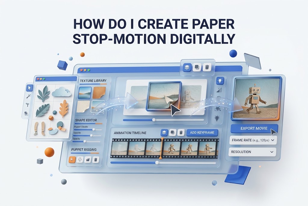
Paper stop-motion has a handmade charm that polished 3D animation often cannot match. Cut paper textures, small shadows, and slightly imperfect movement make a scene feel personal and memorable. You can create this style without a studio full of equipment by combining simple craft materials with digital animation tools.
If you have ever asked, “How do I create paper stop-motion digitally,” the answer starts with a smart workflow rather than expensive software. You can design paper elements on a tablet or computer, animate them frame by frame, and add realistic texture, shadows, and movement. This approach gives you the flexibility of digital editing while preserving the warmth of traditional paper animation.
Planning a Paper Stop-Motion Concept
A strong paper stop-motion project begins with a simple idea that can be communicated through clear shapes and movement. Choose a short story, product demonstration, social media clip, or educational sequence. Keep the action focused, especially for your first project, because every movement requires careful frame-by-frame attention.
Create a basic storyboard before designing assets. Sketch the main scenes, note where objects enter or leave the frame, and identify important transitions. Your storyboard does not need polished artwork; it needs to show timing, composition, and visual direction. This saves time once you begin creating digital paper pieces.
Choosing a Visual Style
Your visual style should support the mood of the animation. Bright colored paper works well for playful explainer videos, while recycled kraft paper and muted colors can create a more editorial or handcrafted look. Decide whether your pieces will feel cleanly cut, torn by hand, layered, painted, or textured.
Consistency matters more than complexity. Use a limited color palette, a small collection of paper textures, and repeatable shadow settings. When every element follows the same visual rules, the final animation feels intentional. This is especially useful when building several scenes for a longer digital paper animation.
Essential Planning Checklist
- Define one clear message or story for the animation.
- Set a target duration before creating assets.
- Sketch a storyboard with key poses and transitions.
- Choose a consistent paper texture and color palette.
- List all movable elements, backgrounds, and props.
- Decide the final video format for social media, web, or presentation use.
Creating Digital Paper Assets
You can create paper assets in illustration software, photo editing software, or presentation-based design tools. Begin with large, simple shapes, such as circles, leaves, speech bubbles, characters, and letters. Avoid highly detailed pieces at first because smaller details become difficult to animate and may clutter the frame.
Build every object on its own layer whenever possible. Separate a character’s head, body, arms, legs, eyes, and accessories if those parts will move independently. Layer separation gives you control during animation and prevents you from redrawing the same item repeatedly for each frame.
Adding Paper Texture and Imperfections
Flat vector shapes can look too clean unless you introduce texture. Apply scans of real paper, subtle grain overlays, irregular edges, or painted marks. You can photograph paper at high resolution, then use those images as clipping masks or overlays within your design files.
Do not make every edge perfectly smooth. Slightly uneven cuts, varied fibers, and minor color changes make a digital scene feel more like practical stop-motion. These details should remain subtle, though. Strong texture can distract from text, faces, and important product features within the animation.
Organizing Files for Animation
Name your layers clearly before exporting them. Use labels such as “Character_Arm_Left,” “Cloud_Background,” or “Title_Letter_A.” Organized assets make the animation process far faster, particularly when you need to adjust one part of a scene after reviewing the first draft.
Export assets with transparent backgrounds in PNG format when your animation software supports it. Keep a master design file containing editable layers, then create a separate folder for exports. This protects your source artwork and helps you replace individual elements without rebuilding the entire project.
Practical Asset Setup Tips
- Create one folder for backgrounds, props, characters, and text.
- Export moving pieces separately from static elements.
- Use transparent PNG files for layered scenes.
- Keep texture overlays available as reusable assets.
- Save editable source files before flattening any artwork.
- Use descriptive filenames to prevent confusion during editing.
Setting Up the Digital Animation Workspace
A clean workspace makes paper stop-motion easier to manage. Create your project at the correct dimensions from the beginning. Vertical video works well for short-form platforms, while horizontal video is usually better for website headers, tutorials, and presentation screens. Square formats remain useful for some social posts.
Choose a frame rate that matches the handmade style you want. Many paper stop-motion videos look effective at 12 frames per second because the motion remains slightly choppy and tactile. You can animate at 24 frames per second while holding each drawing or asset for two frames to achieve a similar effect.
Using Layers Like Physical Paper Pieces
Think of each digital layer as a physical cutout placed on a tabletop. Background layers sit at the bottom, larger scenery appears above them, and foreground props occupy the highest levels. This approach helps you create depth without using complicated 3D animation techniques.
Arrange layers to allow small overlaps between objects. A flower can sit partly behind a character, while a foreground leaf can cross the edge of the frame. These overlaps make the animation feel like a crafted set rather than a collection of floating images arranged on a blank digital canvas.
Creating a Virtual Camera
A virtual camera adds movement without requiring you to redraw every scene. Slow zooms, gentle pans, and small rotations can make a stationary composition feel alive. Keep these movements restrained so they do not compete with the deliberate, frame-by-frame motion of the paper elements.
Use camera movement to direct attention toward the key idea in each scene. For example, you might slowly push toward a product label, pan across a growing paper landscape, or pull back at the end to reveal a completed message. Small shifts often feel more believable than dramatic moves.
Motion Settings Comparison
Animation Style | Best Use | Suggested Frame Rate | Visual Effect
Frame-by-frame movement | Characters and expressive actions | 12 fps | Handmade and tactile
Held-frame animation | Simple objects and typography | 12 to 24 fps | Choppy but controlled
Keyframe movement | Camera pans and large transitions | 24 fps | Smooth supporting motion
Mixed technique | Brand videos and explainers | 12 to 24 fps | Balanced handcrafted style
Animating Paper Elements Frame by Frame
Frame-by-frame animation is where the paper stop-motion look becomes convincing. Move an object a small amount between frames, then preview the sequence frequently. Larger jumps create faster movement, while tiny changes create slower action. Start with simple actions, such as a ball rolling, a leaf falling, or a hand waving.
Avoid making every frame mathematically perfect. Real paper stop-motion includes tiny shifts in position and rotation. Add small variations to make an object feel manually adjusted between shots. This controlled inconsistency gives the animation its distinctive character and keeps it from looking like ordinary motion graphics.
Animating Characters and Props
Break character actions into key poses first. For a walking character, create contact, passing, and step positions before filling in additional frames. A basic walk cycle can look charming with only a few distinct poses, especially if the design itself has strong shape language and readable body movement.
Props often need less animation than characters. A paper cup might slide into frame, tilt slightly, and stop. A cloud may drift slowly across the background. Save detailed frame-by-frame work for the focal action, then use simpler movement for background elements to maintain visual hierarchy and production efficiency.
Using Holds and Pauses
Stop-motion feels better when important poses have time to register. Hold an expression, product reveal, or final word for several frames before moving onward. These pauses make the animation easier to follow and allow viewers to absorb the intended message before the next action begins.
Use holds to create rhythm rather than dead space. A character can pause before reacting, a paper object can settle after landing, or a title can remain still before disappearing. Well-placed stillness creates contrast, making the moving sections feel more energetic and intentional.
Improving Timing and Movement
Review your animation as a video rather than judging individual frames in isolation. A sequence can look awkward when paused but feel natural during playback. Watch it repeatedly at normal speed, then adjust timing where actions seem too rushed, too slow, or disconnected from the scene’s overall rhythm.
Use reference footage for realistic actions. Record yourself picking up a cup, opening a book, or walking across a room. You do not need to copy every movement exactly, but real references reveal where objects accelerate, pause, change direction, and settle after motion.
Movement Principles for Better Results
- Start and end actions with smaller movements.
- Use larger position changes during the middle of fast actions.
- Hold key expressions long enough for viewers to notice them.
- Add slight rotation when paper pieces move across the frame.
- Let objects overshoot a little before settling into place.
- Keep background motion slower than foreground action.
Adding Realistic Shadows and Depth
Shadows are one of the most effective ways to make digital paper animation feel physical. Add soft, slightly offset shadows beneath cutout pieces so they appear lifted from the background. Use low opacity and moderate blur, because dark hard-edged shadows can make the scene look artificial.
Adjust shadow direction consistently across the entire project. If light appears to come from the upper left in one scene, keep that direction for every object in later scenes. Consistent lighting creates a believable miniature set and helps viewers accept the digital paper illusion without noticing the technique itself.
Layering Backgrounds and Foregrounds
Create depth by using at least three visual planes: background, middle ground, and foreground. A sky texture can sit behind hills, while trees, characters, and decorative objects occupy the middle. Leaves, frames, or oversized paper shapes can sit closest to the camera and partially cover the scene.
Parallax movement strengthens this effect. Move distant layers slowly, middle layers at a moderate rate, and foreground pieces more quickly as the camera pans. Even a gentle difference in speed can make a flat digital scene feel dimensional, adding richness without making the design overly complicated.
Adding Sound Effects and Music
Sound gives paper animation more personality. Small rustling sounds, taps, slides, and soft pops can reinforce the idea that paper pieces are moving by hand. Match sounds carefully to visible actions, particularly when an object lands, folds, tears, or enters the frame.
Choose music that supports the pace rather than overpowering it. Light percussion, acoustic instruments, and gentle melodies often work well with handcrafted visuals. If the video contains narration, lower music levels enough to keep spoken content clear. A polished audio mix can make simple visuals feel significantly more professional.
Important Finishing Details
- Add subtle paper rustle sounds to key actions.
- Keep shadow settings consistent across every scene.
- Use foreground elements to create visual depth.
- Preview the animation with and without audio.
- Check that text remains readable on smaller screens.
- Leave enough time at the end for the final message to be seen.
Choosing the Right Digital Tools
The best software depends on your current skills and the level of control you need. Layer-based motion graphics software is useful for complex projects, while simpler editing apps can handle short social clips. Tablet illustration apps are excellent for drawing textured paper pieces before importing them into an animation timeline.
You do not need to master every tool before beginning. Pick one design program and one animation or video editing program, then focus on a short project. As your process improves, you can add more advanced features, such as camera tracking, puppet controls, or compositing effects.
Simple Tools for Beginners
Beginner-friendly tools are best for testing an idea quickly. Look for software that supports layers, basic keyframes, image import, and timeline editing. These features are enough to create moving cutouts, title sequences, and simple story scenes without building a complicated production pipeline.
For useful supporting techniques, review [digital animation basics] before tackling more detailed sequences. You can also adapt ideas from [creative video storytelling] when planning scenes that need a stronger narrative structure. Clear storytelling improves results even when the animation style remains intentionally simple.
Advanced Tools for More Control
Professional animation software gives you more control over timing, masks, cameras, color correction, and layered compositions. These features are valuable when creating branded videos, educational series, advertisements, or larger projects where consistent visual quality matters across many scenes.
More advanced tools also make revisions easier. You can replace a logo, adjust a color, change the timing of a scene, or update text without rebuilding the entire animation. This flexibility is especially helpful for client work, where feedback often arrives after the main sequence has already been animated.
Editing, Exporting, and Reviewing the Final Video
Before exporting, inspect the video at full size and on a small screen. Paper textures that look attractive on a large monitor may become noisy on a phone. Text may also become too small, especially in vertical videos where viewers are likely to watch quickly while scrolling.
Check transitions frame by frame if anything flickers unexpectedly. Small gaps between layers, accidental transparency, or misaligned shadows can become visible during playback. Correct these details before adding the final sound mix, captions, and export settings. A careful review protects the handcrafted illusion you worked to create.
Selecting Export Settings
Use a widely supported video format such as MP4 with H.264 encoding for most online uses. Export at the same frame rate used for your editing timeline to avoid unexpected changes in motion. Choose a high enough bitrate to preserve textures without creating unnecessarily large files.
Create multiple versions when the video will appear on different channels. A short vertical version may work best for mobile social platforms, while a horizontal version can suit a website or presentation. Keep your original project files and high-resolution exports so future revisions remain straightforward.
Reviewing for Visual Consistency
Watch the final video without sound first. This makes it easier to notice pacing issues, unreadable text, unclear actions, and inconsistent lighting. Then watch it again with audio to check whether music and sound effects reinforce the timing of the visual movement.
Ask one or two people to view the piece before publishing. Fresh eyes often spot moments that are confusing to a creator who has watched the sequence many times. Their feedback can reveal whether the story is clear, the visual focus is obvious, and the paper effect feels believable.
Final Export Checklist
- Confirm the correct aspect ratio for the publishing channel.
- Check text, logos, and key objects at mobile size.
- Review shadows and layer edges for accidental gaps.
- Match export frame rate to the project timeline.
- Test audio levels with headphones and speakers.
- Save a clean master file before creating compressed versions.
Common Mistakes to Avoid
Many beginners animate every object at the same speed, which makes scenes feel flat and mechanical. Instead, give each element a purpose. Characters need expressive movement, background details need restraint, and decorative objects should support the scene without pulling attention from the central message.
Another common issue is adding too many textures, colors, and effects at once. Paper stop-motion works best when the materials feel deliberately chosen. Limit the number of visible textures and allow negative space around important elements. A simpler scene usually feels more handmade and polished than a crowded one.
Building a Repeatable Workflow
Once you complete one project, document the process that worked. Save color palettes, shadow presets, texture files, title styles, and export settings. A repeatable workflow lets you produce future paper animations more quickly while maintaining a recognizable visual identity across your content.
Create a reusable asset library for common objects such as clouds, leaves, stars, speech bubbles, hands, frames, and paper labels. You can adjust colors and scale for each new project. This approach reduces production time while still leaving room for original storytelling and custom scene design.
Conclusion
Digital paper stop-motion combines the creative appeal of cut-paper craft with the convenience of editable animation software. The strongest results come from thoughtful planning, organized layers, restrained motion, believable shadows, and sound that supports the physical feel of each action. You do not need complex characters or expensive equipment to make a scene feel engaging.
Start with a short concept, create a few textured assets, and animate one clear action at a time. As you gain confidence, add layered backgrounds, camera movement, detailed sound design, and more expressive characters. The key is to preserve the small imperfections that make paper animation feel tangible rather than overly polished. When you approach the process with patience and a consistent visual system, How do I create paper stop-motion digitally becomes a practical creative skill you can use for social content, brand storytelling, lessons, and personal projects.
Frequently Asked Questions
What software is best for digital paper stop-motion?
Layer-based animation or video editing software works best because it lets you move individual paper pieces separately. Choose a tool that supports PNG imports, timelines, keyframes, masks, shadows, and easy video export settings.
Do I need to use real paper textures?
Real paper textures are optional, but they can make the animation feel more convincing. You can scan, photograph, or download licensed textures, then apply them subtly to shapes, backgrounds, and decorative elements.
What frame rate should I use for paper animation?
Twelve frames per second is a popular choice because it creates a handcrafted stop-motion feel. You can also work at 24 frames per second and hold each pose for two frames to maintain a similar rhythm.
How long does a paper stop-motion video take to make?
Timing depends on the length, detail, and complexity of the animation. A simple ten-second clip may take several hours, while character-driven sequences with many moving layers can require significantly more planning and revision.
Can digital paper stop-motion work for business content?
Yes, this style works well for product launches, explainers, educational posts, social campaigns, and brand stories. Its handmade appearance can make messages feel approachable, distinctive, and more memorable than standard stock-based video content.
0 Comments